Onboarding acts as the TV pilot for any product. In the first few screens it should give users not only an understanding of what that the product or service provides, but also a sense of tone as well.
While at Script Save, I lead the design for a health and wellness product focused on activity tracking and nutrition education. I was tasked with defining what a new onboarding experience would look like considering not only existing, but brand new features.
My first task was to collect data and feedback related to the onboarding flow and begin to formulate solutions. I interviewed a small group of users and collected survey results to come up with the following pain points.
"There are too many questions, I feel like I'm filling out a form at the doctors office."
"It feels too clinical"
"Why do you need my location? I just started."
Based on this feedback I determined my goals were the following:
Reduce Steps
Refine old, make room for new
Inject Personality
Below I'm going to show how I met these goals during my redesign.
In it's first state, the flow consisted of a minimum of 22 screens that a user would have to navigate (this also did not include follow up screens). These screens featured an array of questions and options that we would use to create a bespoke experience related to health conditions, allergies, and biometrics.
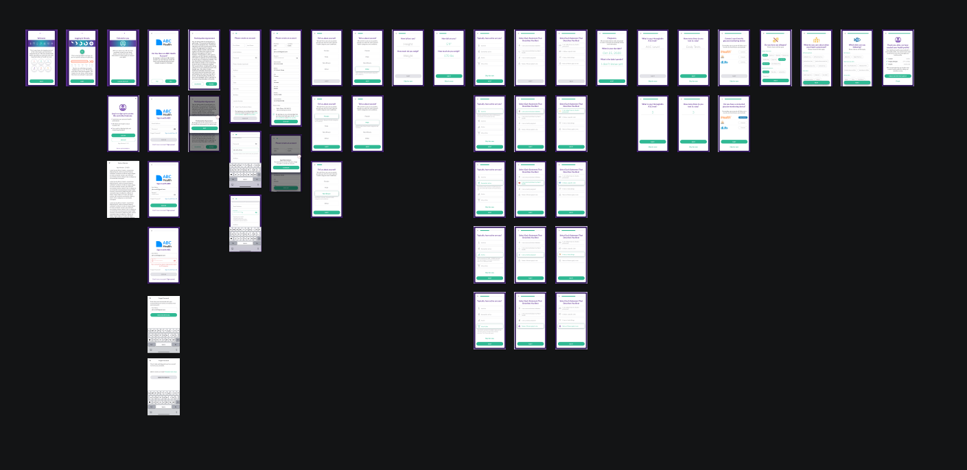
The original experience flowed as the following:
Intro > Sign Up/In > Participation Agreement > Bio-metric Questions > Activity Question > Health Condition Questions > Device Connect > Allergies & Diets > Finish
Once I had a good idea of the information we collected and level of importance of each piece, opportunities presented themselves to restructure the moments of collection.
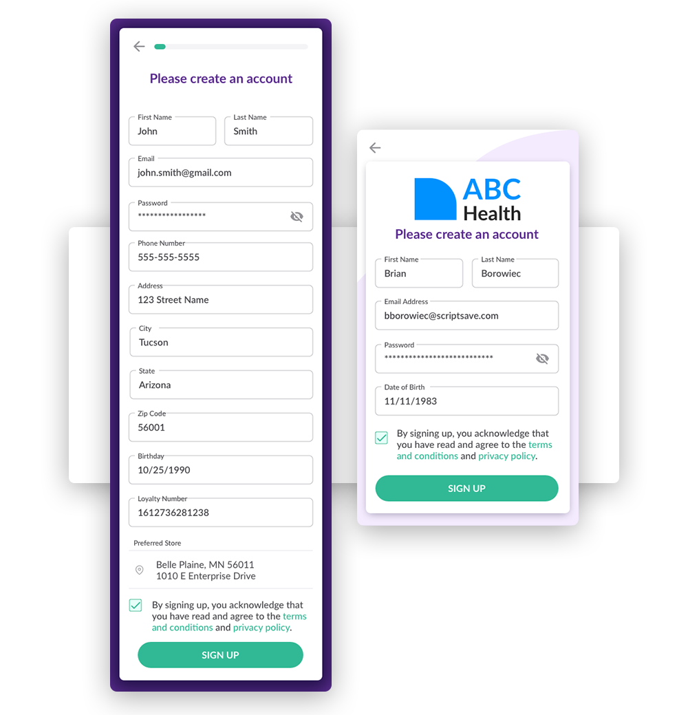
During Sign-Up, I reduced the amount of entry fields by over half not only to make the experience more light-weight on the front end, but to also make collection make more sense by giving it actual context at other moments in the experience.
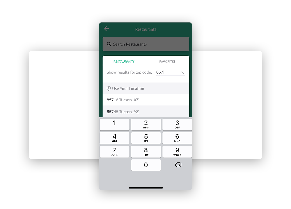
One example was that zip code was only used in our restaurant feature so moving the collection to the moment when it was actually being used gave the user more context as to why we are asking for the information.
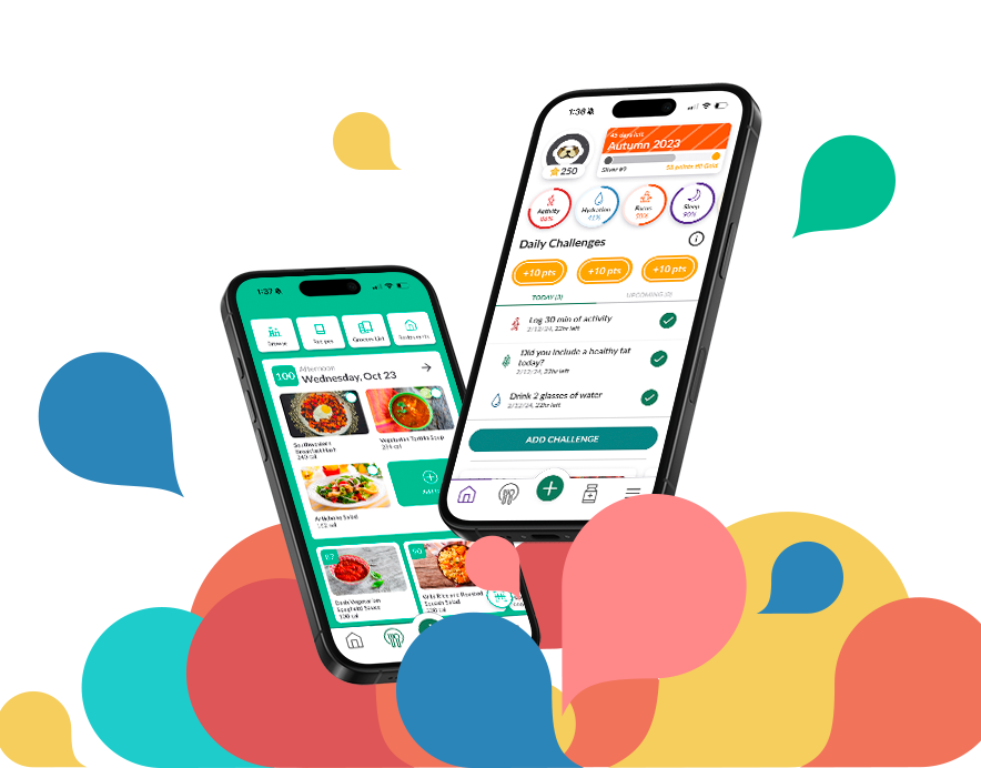
By far the largest reduction in steps came from creating an accordion with a chip selection to help us learn about the users health concerns, food allergies, and dietary restrictions.
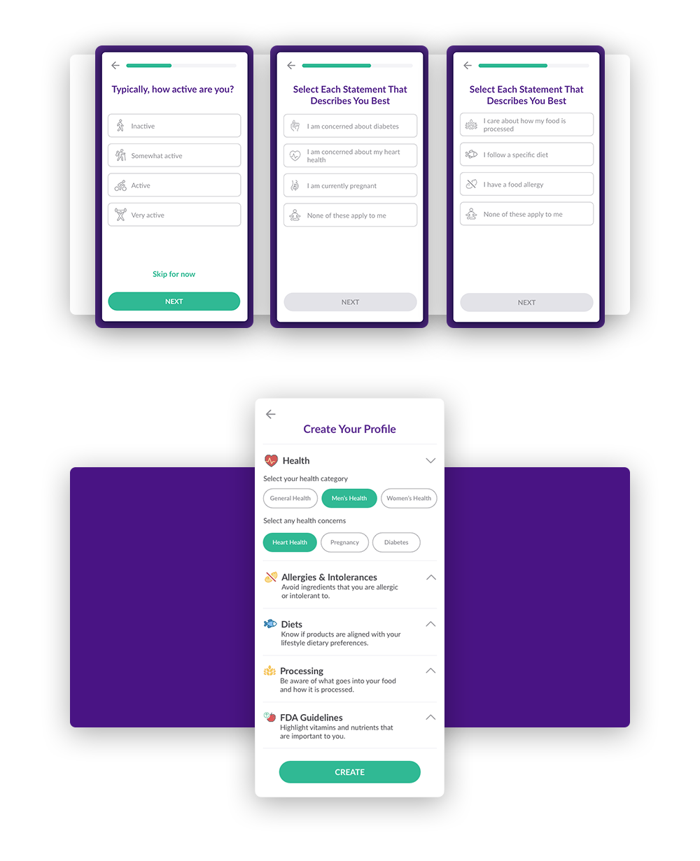
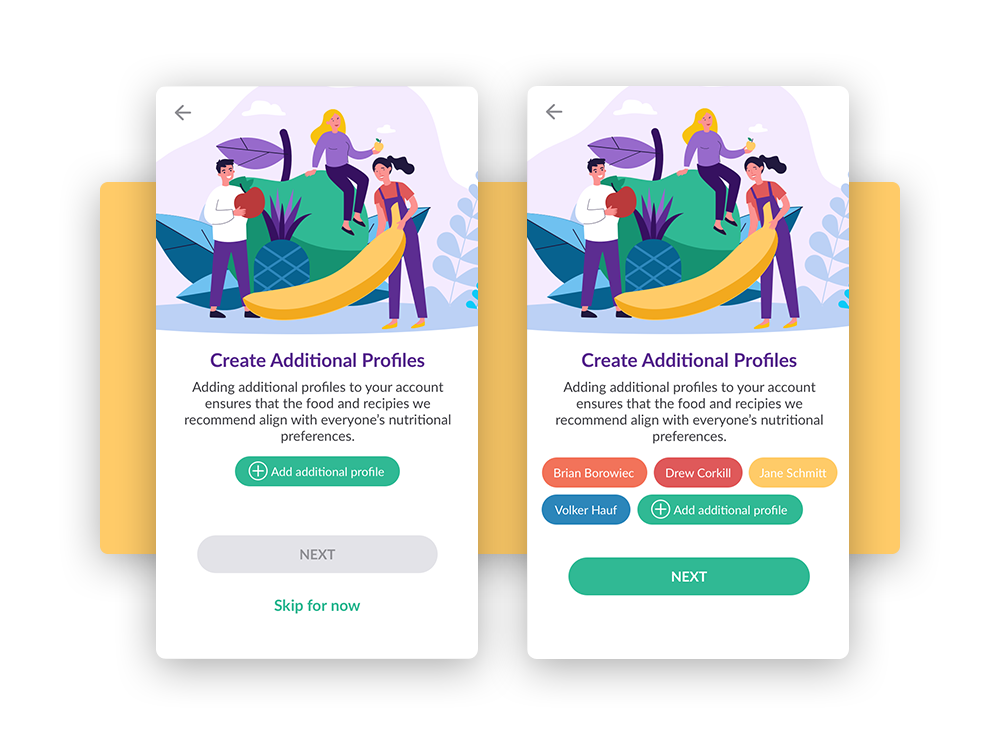
I would also consolidate each of these personal elements into the users private profile which remained distinct from their account they sign in with for privacy. This also gave us the flexibility to add multiple profiles to a single account for family nutrition guidance which leads me to my next goal.
While this goal has a bit less to do with making an experience "friendlier," it removed a lot of pain points from the old onboarding and added new functionality with primes a user to what the app has to offer.
Alongside consolidating the health and nutrition questions we were asking to one page, I had to add the ability for multiple health profiles to be added to a single account. This was so families or small groups could search our nutrition features knowing everyone's concerns were considered. It also made our recommendations of recipes or health articles more accurate.
This feature slotted perfectly after the initial profile creation and simply just asks if you would like to create additional profiles.
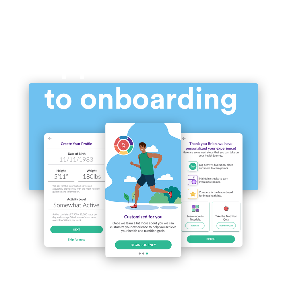
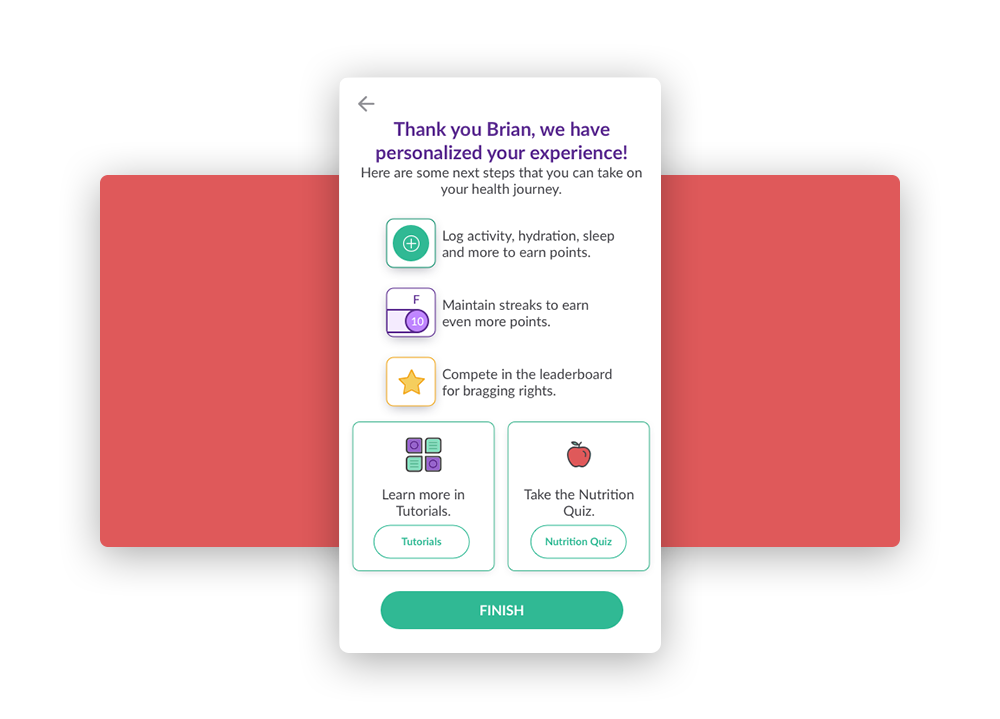
Another Example of making room for new would be at the last moment of onboarding. The original design gave you a brief summary and then dropped you at the home screen with no direction as to what to do next.
I felt that this was a great opportunity to educate the user to the main loop of the experience as well as give them recommended paths to next steps. One of the paths included a link to our comprehensive tutorial section.

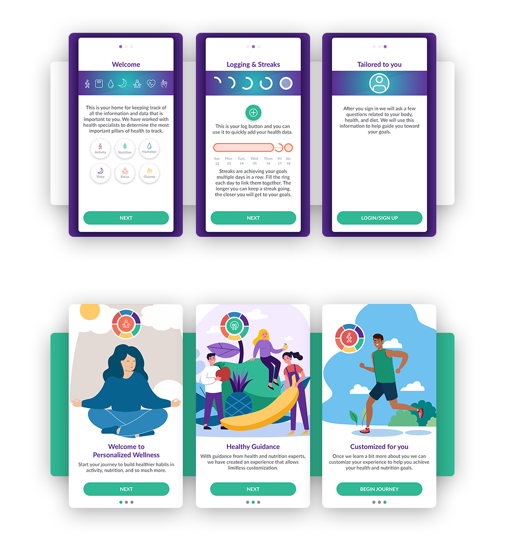
The visual design language was kept simple on purpose because in it's original state this product was meant to be white-label for future partners. The decision evolved over time to create more opportunities to bring friendly imagery and visual design into the fold. The onboarding redesign would be the testing ground for these opportunities.
The original experience utilized icons as a visual language but really never ventured into anything else. I brought in colorful illustrations which not only established a real visual language, it forced us to consider being more direct with our introduction which made for a friendlier experience.
All of these changes to the onboarding significantly brought our abandon rate down as well as created better identity sentiment. This redesign was a success by all metrics and helped influence the visual language that cascaded throughout the rest of the product.