Client Brief
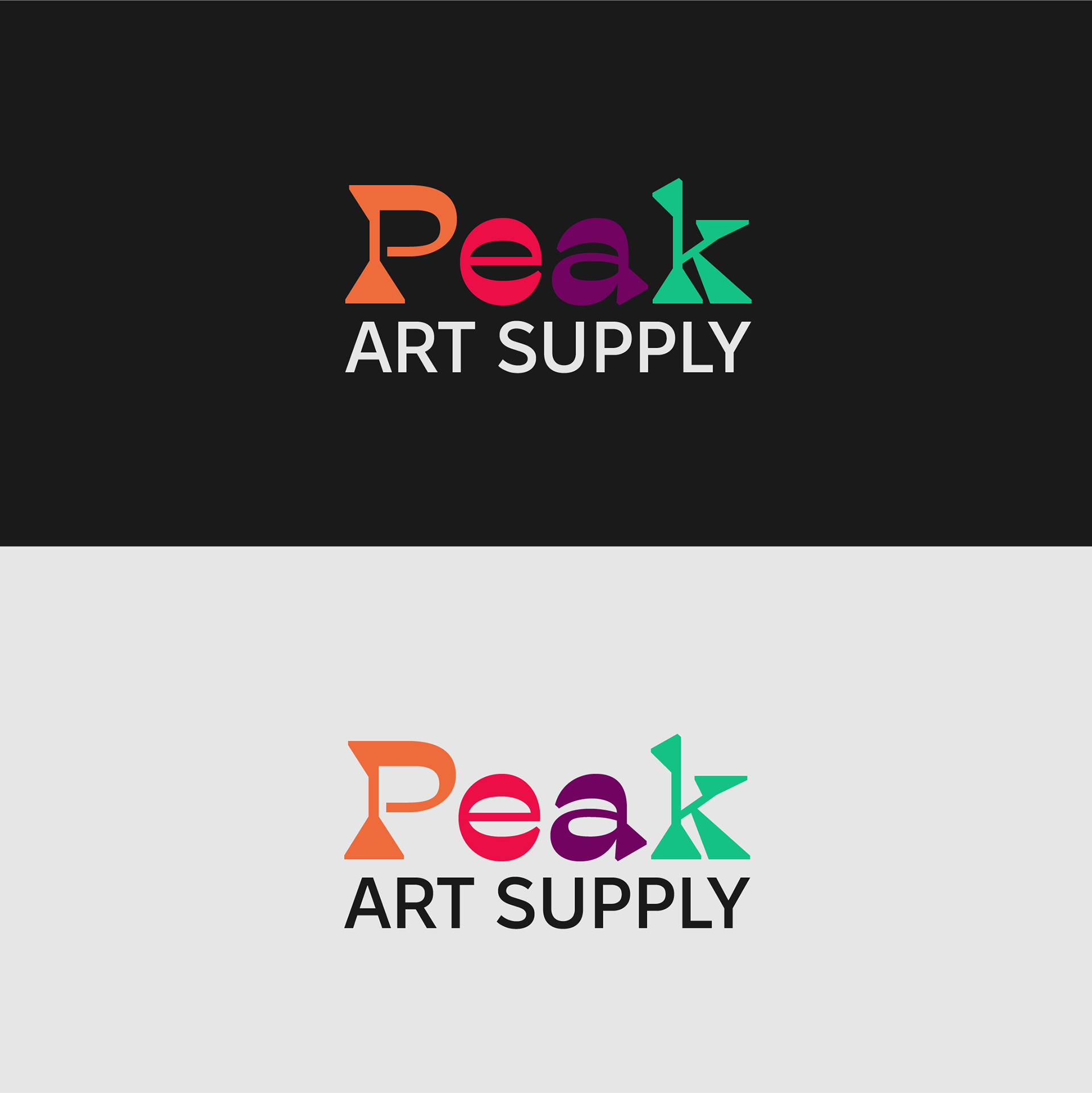
Peak Art Supply is a vibrant and modern art supply store catering to artists of all levels — from beginners and students to professionals. Our goal is to inspire creativity and help customers reach their creative peak with quality materials and a fun, welcoming atmosphere.
Target Audience:
Hobbyists and professional artists
Students and educators
Creatives of all ages
People who love self-expression and color
Logo Goals & Objectives:
We want a logo that:
- Captures the creative energy of our brand
- Reflects the vibrancy and variety of art supplies
- Feels modern, fun, and approachable
- Can be easily recognized and remembered
- Works across different mediums (signage, packaging, web, etc.)
Design Elements to Include:
- Colorful elements that reflect creativity (e.g., paint splashes, color gradients, palettes)
- A modern, playful typeface that feels fun but still clean and legible
- Optional: Incorporate visual nods to mountains/peaks if it fits the design, symbolizing "reaching your creative peak"
Design Preferences:
Style: Modern, creative, and fun — but not overly childish
Colors: Open to a vibrant palette — bold and bright tones that evoke artistic expression
Typeface: Custom or modern sans-serif with personality (no generic fonts)
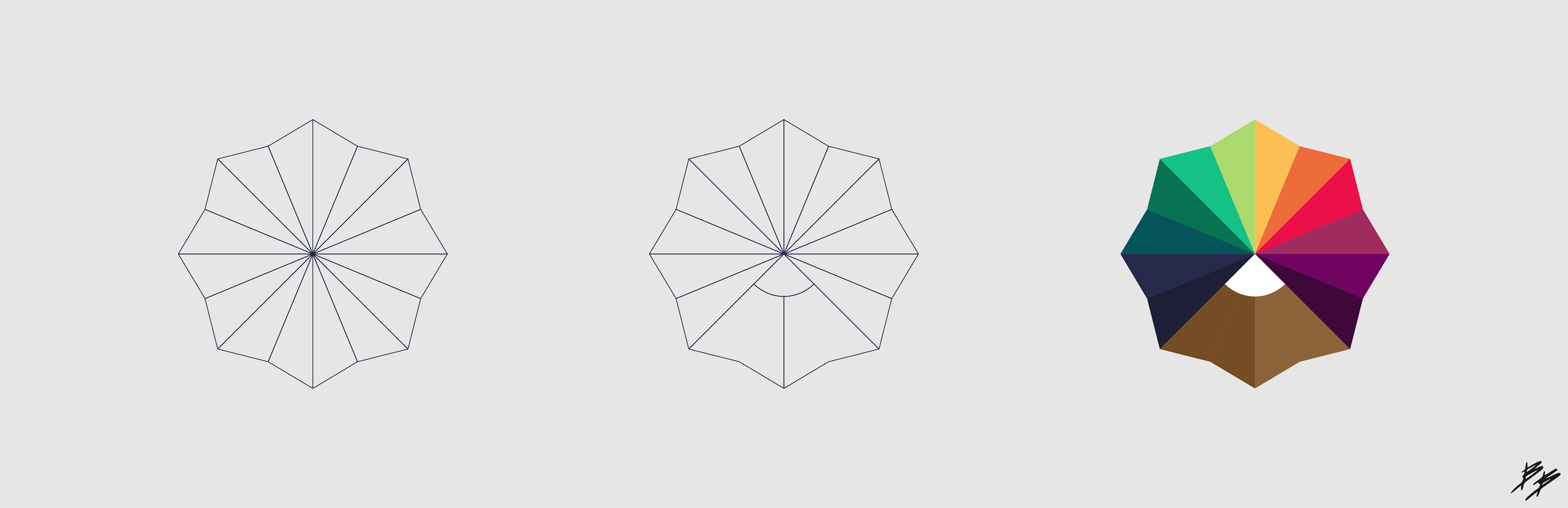
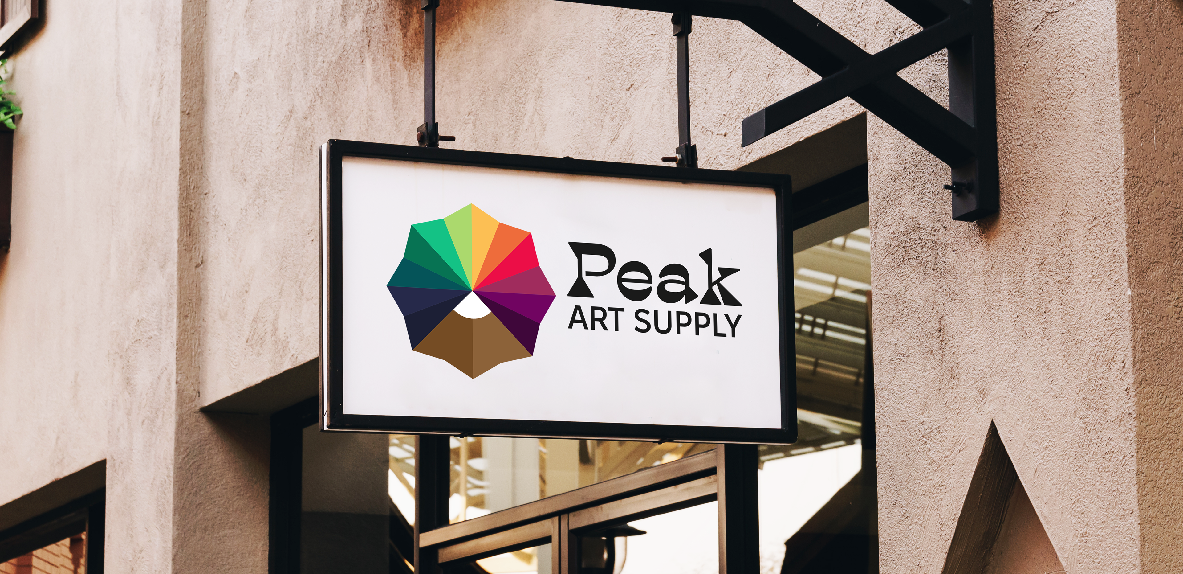
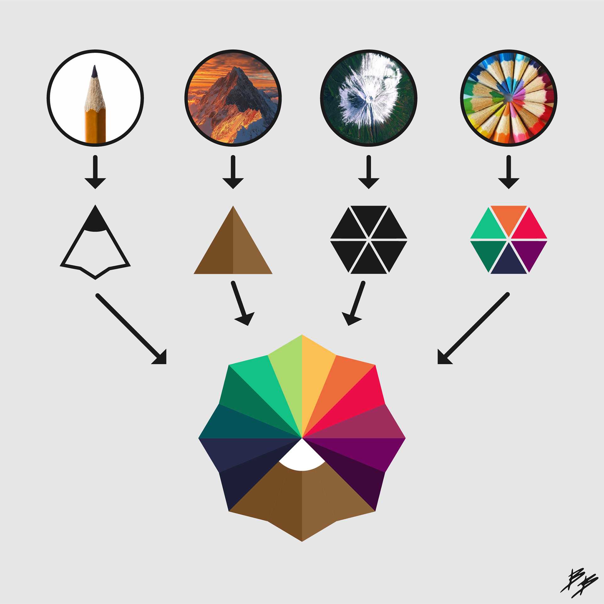
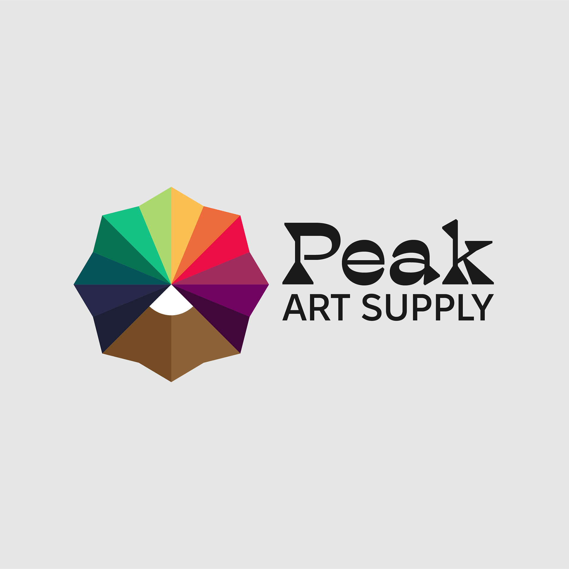
Logo Breakdown
The geometric radial shape was initially inspired from a bird's eye view of a mountain top. When attempting to connect a pencil shape, I loved the way it also resembled a snow capped mountain further linking the logo to the "peak" symbolism. Most brands would never feature the array of colors such as this, but an art supply business could easily incorporate this curated rainbow as a part of their brand identity, especially to support a creative and vibrant tone.
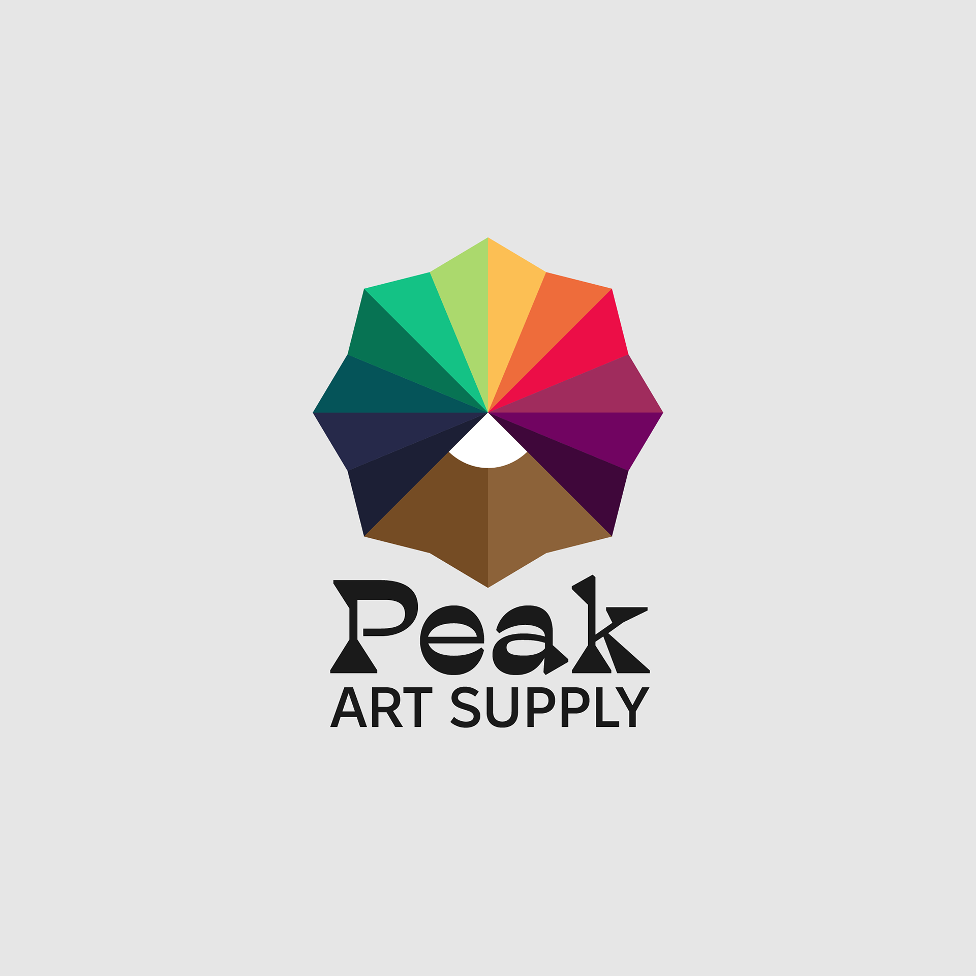
Type Lockup
A logo-less type lockup was also provided as an option when the radial mountain top did not make sense.