Client Overview
Willow & Flint is a boutique home goods brand focused on hand-crafted, sustainable products for intentional living.
We source eco-friendly materials and partner with local artisans to create timeless pieces for modern homes.
We source eco-friendly materials and partner with local artisans to create timeless pieces for modern homes.
Project Goals:
• Create a distinctive logo that reflects the brand’s personality: natural, minimal, and sophisticated.
• Develop a cohesive brand identity including typography, color palette, and supporting • Ensure brand assets can be applied effectively across packaging, social media, website, and print.
Deliverables:
• Primary logo and variations (horizontal, stacked, icon-only)
• Brand color palette (primary, secondary, neutrals)
• Mockups for real-world application (e.g. packaging, Instagram, tote bag)
Design Style Preferences:
• Organic and clean
• Earthy, muted tones
• Elegant serif or modern serif fonts
• Minimal use of graphic flourishes, favoring texture or negative space
• Natural imagery (leaves, wood grain, linen textures)
Target Audience
Design-conscious consumers (ages 28–45) who value sustainability, handmade quality, and calming aesthetics.
Often urban dwellers or suburban homeowners, leaning toward slow living and minimalism.
Timeline:
Ideal delivery within 3–4 weeks, including 2 rounds of revisions.
Ideal delivery within 3–4 weeks, including 2 rounds of revisions.

Inspiration
I wanted to create the logo for Willow & Flint without any iconography. Most high end furniture business' utilize a simple type treatment, but I did not just want to do that either. To create something unique and creative I opted to design custom letters based on a few different typefaces. I still felt that the letters on their own were not expressive of the brand enough so I got creative.
Drawing inspiration from swaying willow trees, I added a left leaning curve to the tops of the w's and the middle bar on the F. Tilting the o also added to the effect of movement.
With the flowing nature of a willow tree, I also needed some more angular elements to represent the "flint" aspect of the branding. The caps for the L's and I's were the perfect place to do this as it achieved my goal while not competing with the established flowing methodology.
A custom ampersand was also created to further emphasize the effect.

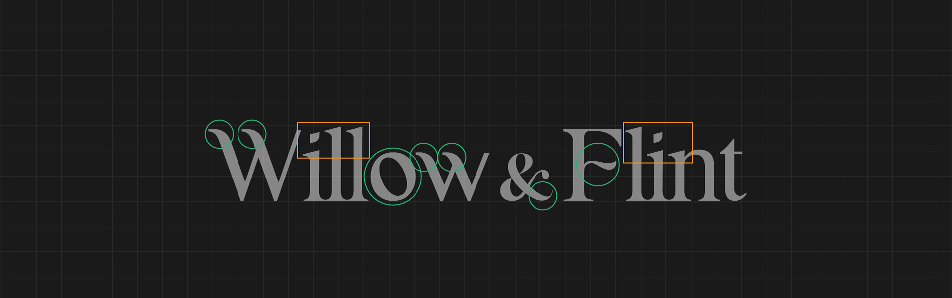

Balance and harmony was always at the forefront of my mind when building this logo. Perfectly balanced like the furniture pieces, the type needed to have a similar structure but remain elegant and legible.